Member-only story
Accessible Colors for Data Visualization
Part 1: Open-source style guide.
A good graph is easy to read. A goal when creating data visualizations is to convey information in a clear and concise way. One of the most prominent features of most data visualizations is color, but what happens to a graph for someone who has difficulty differentiating colors?
For example, an orange and green color that may appear separate to some could appear nearly identical to individuals with protanopia vision, a type of colorblindness.

At Square, we’re building a guide for visualizing data so that data is accessible to as many people as possible. Today, we’re open-sourcing the design file to continue evolving this resource. Additionally, later this year, we’re open-sourcing a Python package for you to easily use and adapt this design file in your visualization work.
First, let’s look at what data visualizations and color vision deficiencies are:
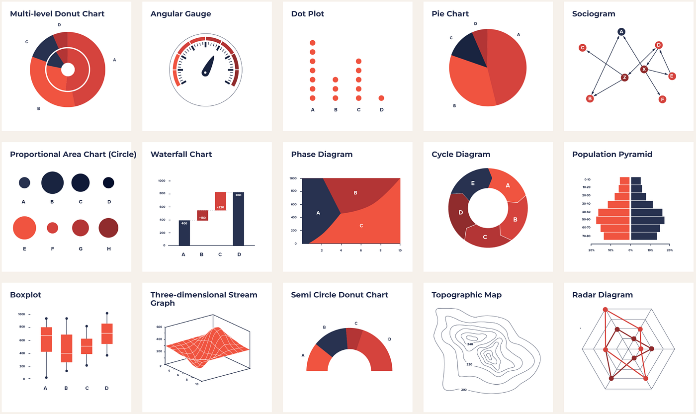
Data visualizations
Data visualization (visualisation), or the visual communication of data, is the study or creation of data represented visually. Michael Friendly describes it as, “information that has been abstracted in some schematic form, including attributes or variables for the units of information.” Nicholas Felton describes his work as, “translating quotidian data into meaningful objects and experiences.”
Data visualization comes in many forms. Some of my favorite places to look at and think about different types of visualization:
The Data Viz Project by Ferdio, a Copenhagen-based infographic agency.
Giorgia Lupi and Stefanie Posavec’s project Dear Data — now a part of the Museum of Modern Art collection — is a collaboration of personal data visualizations that Giorgia and Stefanie mailed to each other on postcards.

